Signs are everywhere. They are one of the most commonly employed forms of physical advertising. We challenge you to walk down your local main street and not see at least one sign that makes you want to learn more. So, how can businesses stand out in a market like this?
Components Of Any Sign
There is a basic formula, or recipe, to any sign. Though it may not be obvious, every sign in some way follows this plan. We’ll break it down for you.
The Headline
Like any good news story, the headline is the first thing that’s going to grab your attention. It can be anything; from a saying, to the name of the business. Keep headlines short and to the point. If the message isn’t clear to a potential customer within the first five seconds, it’s not going to be very effective.
Explanatory Text
Here’s where it gets interesting. While the headline grabs the attention, the explanatory text can sometimes be equally as effective. Look at restaurants for example. While you cannot do much to change the name, the tagline is often what is remembered. This can be a challenge for some. Overthinking it can lead this message to be very convoluted and confusing.
Call To Action
Don’t leave people hanging; reel them in. Once they’ve seen your message, bring them inside. Complete that chain through a call-to-action. Prompting people to engage is the key goal of advertising. A simple “come on in,” or “try this today,” are effective calls to action.
Industry Tips/Tricks
There are a number of things to keep in mind while designing your sign. Colour and content are two very broad terms. Each trickles downward a number of ways.
Approach It Like A Journalist
Journalists vie for our dwindling attention spans on a daily basis. Their content needs to be punchy and to the point. Take this approach in the early stages of your design as it will allow you to layout what you want to do. You can then work on each component individually, getting the most from your investment.
Blank Space
You would be surprised how effective blank space can be. Take this billboard showing the iPad mini, for example. There is so much seemingly unused white space here. It is accented by the black logo and name, as well as an image of the actual product in the corner. These signs draw you in immediately, and the use of white space has been known to improve retention. It also helps create balance between the various element of the sign.
Images
The use of photos or images can be tricky. You don’t want an image to detract from the purpose of the sign. Keep in mind images that will compliment the message and relate to the colours and font of your sign. You will also want it to be legible. Don’t select an image that will become distorted when resized.
Font
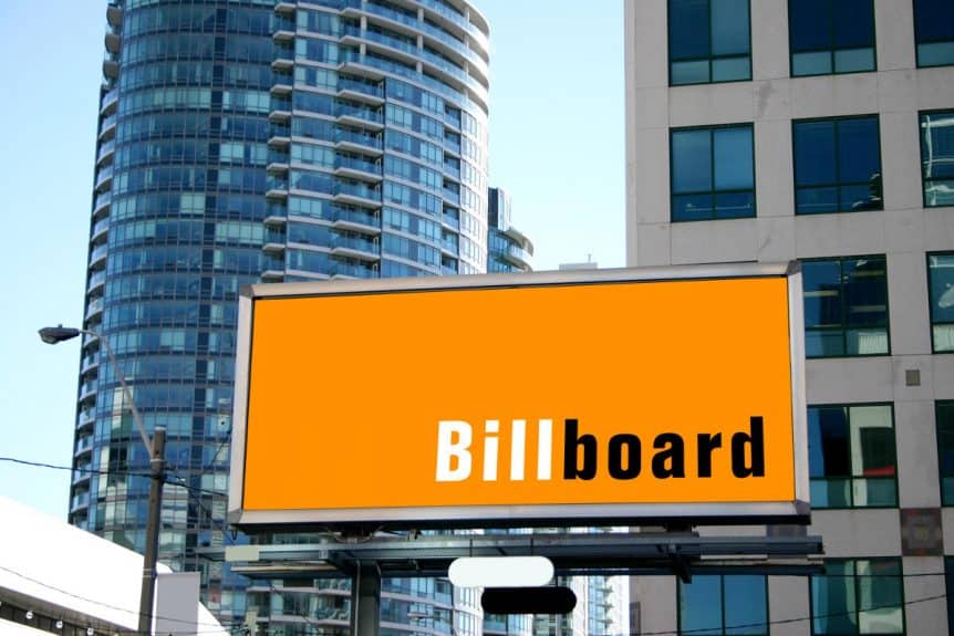
Your choice of font is important. You need to take into consideration where you will be placing your sign, as it will guide you to what font will work the best for you. If it is a larger billboard like the one pictured above, your font needs to be bold and readable. Smaller, in-store signs give a little more leeway with your choice of font as a customer can stop to read it without causing a traffic jam.
Types of Signs
There are three different types of signs that serve three different purposes.
Outdoor
Outdoor signs must be placed in a highly visible area and not disrupt the flow of foot traffic in the area. They must be direct and to the point. As people will only see them in passing, you’re aiming for that double take. The first thing you should be doing is searching for a clear and concise way to communicate your you message.
Informational
Even more so than outdoor signs, informative ones need to get straight to the point. You won’t find this advertising the who (business), more so the what (sale/service/promo) or why (only place in town/we’re the best/etc). They aim to increase engagement by triggering the impulsive buy.
Persuasive
An impactful sign makes you think. It is meant to play off any emotion the advertiser believes should be associated with the product. This could be done utilizing any of the tips and tricks we mentioned earlier. Persuasive signs can appear anywhere, and display anything. They are meant to promote engagement. In the hyperconnected digital age, giving people a reason to pull out their phone and look you up could lead to stronger engagement.
Location, Location, Location
Straight out of a real estate handbook, location is one of the most important aspects of signage. If you don’t find the optimal location for your sign, it loses its effect. There are a few things to take into consideration when placing your sign.
Environmental Colours
Something you may not consider when designing your signage are the colours in the space you plan to place it. For example, if you’re placing a sign outdoors near an area with a lot of greenery, you’ll probably want to avoid picking similar shades. The point is to stand out; draw people’s eyes in with something that seemingly doesn’t belong.
Out With The Old, In With the New
Put yourself in the shoes of your customer. Take a walk through a local store or down your street. Is there old signage still hanging around? Old signs can detract from anything new that you add. They become faded or dirty. That’s why it’s always important to refresh and revitalize your signage.
Foot Traffic
For an outdoor sign to be effective, it must be placed in an area where people will notice it walking by. Don’t put it right in the flow of traffic, as it could be detrimental to their ability to engage. They may end up passing it off as nothing, and ignoring it. That could be a potential customer walking by.
There is a lot to take into consideration when planning out signage. Factors like the ones we mentioned here will help guide you through the planning process. You can rely on us to ensure you get the best return on your investment!